
So you want to write a newsletter
Accessibility still matters to your readers when news is delivered to their inboxes
Column by
Newsletters are a very old medium that have seen renewed interest in the last decade. The first newsletters originated in Venice, Italy in the middle of the fifteenth century, distributed as handwritten letters with descriptions of current events, market information, and more. Their distribution took off with social and technological developments like organized postal services and the printing press.
In the digital age, newsletters come to our email inboxes instead of to our doors or mailboxes, delivering curated lists of articles, industry-specific insignia, and opinions from our favorite experts. Though this medium has plenty of advantages, like instant delivery, it also presents many challenges for individuals with disabilities who may use screen readers or other assistive technology to access their email. Many of these readers are part of the 2.2 billion people globally who have some kind of near or distance vision impairment, according to the World Health Organization. In order to properly serve these individuals, here are a few tips to make your newsletters more accessible.
Here are four quick and easy tips to make your newsletter accessible.
Though these four tips are not the only considerations for newsletter accessibility, they are great ways to enhance your newsletter content for a broader audience. Accessibility is an essential consideration for all news products, especially those that readers interact with as frequently as newsletters.
Tip 1: Use heading structures whenever possible
Depending on what newsletter distribution platform you use, there may be different options for changing the structure of your newsletter, including using headings and subheadings. If there are two or more distinct sections of your newsletter, ensure you take advantage of these settings instead of simply bolding, italicizing, or otherwise manually adjusting the formatting of your section and subsection headings.
Using the built-in heading and subheading designations doesn’t just change the look of your text, it also changes the text’s code. Screen readers use an email’s underlying code to provide the proper information for the user. Using the heading and subheading designations marks the heading text as its own section, allowing screen reader users to navigate between sections of the newsletter seamlessly. Without the heading and subheading designations in the code, screen reader users can’t jump between sections, making it impossible for them to “skim” in the way a fully sighted reader might.
Tip 2: Do not use emoji as bullet points
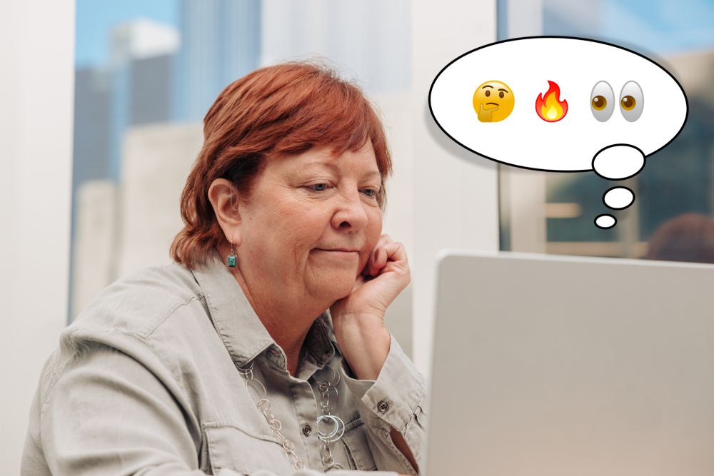
We’ve all seen the newsletters and social media posts that make a list of insights and start each item in the list with a corresponding emoji. It’s true that this tactic can look visually engaging; however, each emoji has a name that screen readers read aloud to users. Too many emoji, emoji inserted in the middle of a sentence or thought, or emoji that have names that seem unrelated to the subject at hand can be confusing for screen reader users and make it difficult for them to read newsletters—or any digital content.
If you really want to use emoji in your newsletter, keep them to one at a time and only use them at the end of a complete thought. Consider how the name of the emoji will sound read aloud in line with where you placed it. You may even try experimenting with a screen reader yourself! For Mac and iPhone users, the built-in screen reader is called VoiceOver; for Windows, Narrator; and for Android, TalkBack.
Tip 3: Always write alt text for images
Photos, graphics, and data visualizations can be amazing ways to enhance your newsletter and illustrate a point to your readers. Alt text is a description of the visual content embedded in the code of your newsletter.
This description makes your visual content accessible to screen reader users, as well as anyone who may have a slow or limited internet connection because the alt text gets displayed in place of the image if the full image can’t be rendered. Further, adding alt text to your images enhances your newsletter’s SEO ranking, helping you get discovered by new readers through search. Most newsletter platforms have an option to add alt text to images—if yours doesn’t, it may be time to consider switching platforms.
Writing alt text doesn’t need to be difficult or complicated. The most important part of writing alt text is to strive to give readers who rely on alt text equivalent information to readers who view the image directly. The best alt text is short and describes the most salient details of the image. If you want to learn more about writing alt text, check out OAJ’s style guide entry on alt text.
Tip 4: Use descriptive link text
When you embed a link within text, it changes the code attached to that text. Visually, this is often indicated to readers through the text color (typically blue) and underlining. In the code that screen readers use, the text is also given a “link” tag, which screen reader users can skip to, much like the process for skipping between sections of the newsletter using headings. When screen reader users skip between links, the screen reader doesn’t read the link address, but instead reads the text with the embedded link. For example:
The Organization for Accessible Journalism has a new website. Check it out here!
The “here” in the above text is all the context a screen reader user would have in the event that they skipped to that link, which provides no information about what the link is or where the reader would be directed if they were to click on it. A better way to write that sentence is:
The Organization for Accessible Journalism has a new website. Check it out!
In the rewritten example, a screen reader user would know that the link embedded in that text has something to do with OAJ. This makes the text much easier to navigate quickly in the event that the reader wants to skim the newsletter or revisit it to find a particular resource.
Or try:
Check out the Organization for Accessible Journalism’s new website!
In this example, a screen reader user would know that the link embedded is pointing to OAJ’s new website. This makes it clear exactly what the link is intending for the user to navigate to when skimming the newsletter.

Emilia Ruzicka is a freelance data journalist, researcher, and editor. They got hooked on accessibility during their undergraduate cognitive science classes that taught about the intersection of information design and the visual processing system. In 2025, they became officially involved with OAJ to create accessibility trainings for conferences, especially targeting digital and data visualization accessibility.
Ruzicka currently conducts investigative research for MuckRock’s Sunlight Research Desk, manages data for the Trans News Initiative, and teaches Basics of AI Ethics and Policy for Brown University’s Data Science Institute. They have published with the Urban Institute, the Center for News, Technology, and Innovation, DataJournalism.com, Source, and other outlets. Ruzicka especially enjoys reporting on health, science, technology, queer issues, and public data. They have an MA from University of Virginia and a BS from Brown University.
This in an opinion. While this piece contains factual information, it is the author’s point of view.
Help keep The Word free to all
The Word is the only magazine focused on accessibility in the journalism industry.
Our publishing organization, the Organization for Accessible Journalism, made a promise from day one that content like this would always be free and never hidden behind paywalls because information is education for the public.
Whether you’re a reporter, editor, an accessibility professional, or a member of the public who happens to be interested in journalism or accessibility, we need your help to keep publishing.
Help The Word by using the donation box below.